Creating “PivotTables” and “PivotCharts”
In Excel, we have a powerful tool for data analysis, namely the “PivotTable”
“Pivot tables” allow us to create and display massive amounts of data in an orderly and meaningful way.
Probably the most useful feature of “PivotTables” is the ability they have to reorganize, recalculate and display our data with an impressive speed .
Together with “PivotTables”, we can create “Reports” that allow us to compare data in a kind of report.
We can also interpret our results of the data from our “PivotTables” to display in a more graphic way.
When you use Excel’97, this possibility is not available to you.
The best way to learn to use “Pivot Tables” is to create one.
Excel allows us to easily create “Pivot Tables” from our data.
First, we select the “Worksheet” for which we want to make a “PivotTable”
Next we select “Data” from the menu bar, select “Pivot Table” or “Pivot Chart” report .
(If you used Excel’97 you choose “Data” – “Pivot Table” from the menu bar.)
This will start the “Pivot Table” and “Pivot Chart Wizard” dialog box.
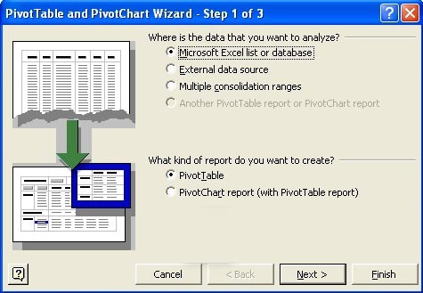
In step 1 of the Wizard we have to choose the source of the data for the “PivotTable”.
First choice is “Microsoft Office Excel list or database”, which captures data from an Excel “Workbook”.
Second choice is “External data source”, which is the data from a database or query retrieval.
Third choice is “Multiple consolidation ranges”, which retrieves data from multiple “Worksheets”.
And last we have a choice to choose data from “Another PivotTable report ” or “Pivot Chart report”.
In the second section of the dialog, we choose the kind of “Report” we want to create.
A “PivotTable” or a “PivotChart report” with “Pivot Table report”.
When we have made our choices we click ‘Next’.
In step 2 of the Wizard we must determine the source of the data for our PivotTable to be created.
Depending on what we have chosen in the first window, this may determine the source to be quite different.
When we chose “Microsoft Office Excel list or database”, click the “Range” button to the far right of the box :.
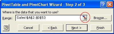
Click and drag over the “Range” that you wish to include in your “PivotTable”.
Click again on the “Range” button and click ‘Next’.
In step 3, we determine whether we want the “PivotTable” or “PivotChart” to be included in a new “Worksheet” or an existing “Worksheet”.
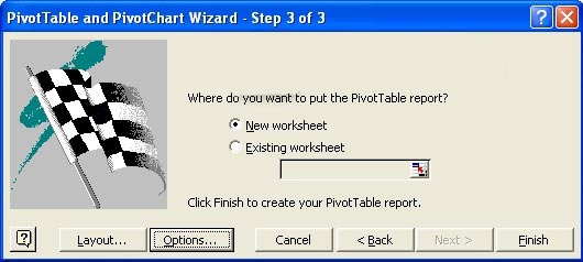
When you’ve selected “existing worksheet”, then you should select the “Worksheet” you want to use, and select the cell you want to use as the top left corner for our “PivotTable”.
In the third window of our wizard, we also use the “Layout…” and “Options…”.
In Excel’97, when you click the “Layout…” button, it shows us the previous version of the “PivotTable” construction in a separate dialog window.
But in later versions of Excel, we place a “PivotTable” directly in our “Worksheet”.
By clicking on the “Options…” button opens a dialog where we can set many options for our “PivotTable”.
We can therefore set these “Options” in step 3 of the Wizard, but we can do so later with the “PivotTable toolbar”,
which we will elaborate on in a subsequent paragraph.
We click “Finish”.
We see the structure of the “Pivot table”, together with the rows and columns with information about our source.
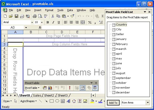
All we need to do now is click and drag the fields from the “PivotTable Field List” to the “Row”, “Column”, “Data” or “Page” zones in the “PivotTable”.
On the “Fields” that are dragged into the “Data” zone, the default “Sum” calculation is performed.
We can always rearrange or remove “Fields” from our “PivotTable” and even customize functions.
Manipulate “PivotTables”
Now we will see ways to adjust a “PivotTable” to calculate and display data.
We can click and drag “Fields” from the “PivotTable Field List” to the desired area in the “PivotTable”.
To remove “Fields” from the “PivotTable”, click and drag the “Fields” back to the “Pivot Table Field List”.
We can also click and drag “Fields” from one section to another section in our “PivotTable”.
When you click in a cell outside the “PivotTable”, the “Pivot Table Field List” disappears.
When we are click on a cell again in the “PivotTable”, the “Pivot Table Field List” will again become visible.
We can filter the information that we wish to see by clicking on the black arrows next to the columns or rows.
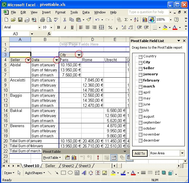
This opens a list of all the values in this column or row.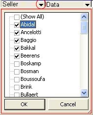
Values that are checked will be displayed in the “PivotTable” but the others will not be displayed.
When you’re finished checking or unchecking click OK.
If you just want the list without making changes, click “Cancel”.
The “PivotTable toolbar”
We use the “PivotTable toolbar” to make changes in the format or data in the “PivotTable” or “PivotChart”.
We open this toolbar by clicking “View” in our menu bar, selecting “Toolbars” and choosing “Pivot Table”.
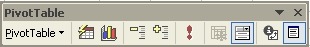
Clicking on the arrow next to “PivotTable” opens a dropdown menu with various com mands that we can perform on our “PivotTable”.
The “Format Report” button opens a dialog box with several already formatted reports, from which we can make a choice.
The “Chart Wizard” button opens the “Chart Wizard”. This is also found in the “Standard toolbar”.
The “Hide Detail” and “Show Detail” buttons are used to show / hide details.
We click the “Refresh Data” button to view data that has changed in our “Worksheet” t o be passed onto our “PivotTable” and “PivotChart”.
We use the “Include Hidden Items in Totals” button to display hidden data to tals or subtotals that may have been excluded.
Displays the field items with dropdown menu
Clicking on the “Field Settings” button allows us to change the settings of the “Field” (e g from sum to average).
Clicking the “Hide Field List” button lets us choose if the “Field” list is to be sh own or not.
Changing “Field Properties “
When we drag a “Field” to the “Data” section of our “PivotTable”, the SUM function assigned to these “Fields” by default.
We could change this by selecting the cell with the name of the data “Field” twhich looks like “Sum of (field name)”
Then click on the “Field Settings” button , in the “Pivot Table toolbar”.
This opens the “PivotTable Field” dialog:
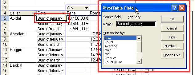
In this dialog, we see the name of the source “Field”.
The name of the “Field” as it is shown in the “PivotTable”.
And the function that is assigned.
We can enter a new name in the text box “Name”, if you wish.
In the list “Summarize by:” we can assign a different function.
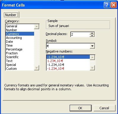
Clicking on the “Number …” on the right side of the dialog box, opens a dialog where we can set formatting for the numbers for this “Field”.
When we click the button “Options>>” we can use the drop-down list the to change the display of our data.
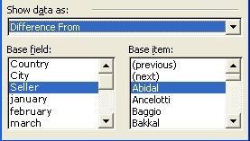
We can compare the values as a percentage of the column, row or the total.
We can show the number as a difference between this Field’s value with that of another “Field”.
When we have a number from one “Field” to be compared with a number from another “Field”, we select the first number in the “Base field” list, and then we select the number in the “Base item” list.
Once the options for our “Field” are chosen, we click the OK button.
“Auto Format” for ” PivotTables”
In contrast to the manual layout, the choices here will also have an impact on the appearance of our “Pivot table”.
Select a cell in the “Pivot Table” and click this button. .
This opens the “Auto Format” dialog box.
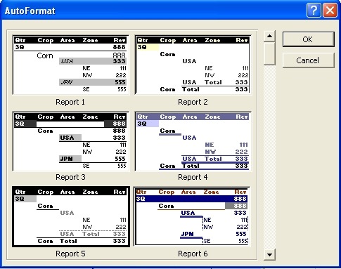
Make your choice and click OK.
“PivotChart” view
We can easily create a “PivotChart” from our “PivotTable”.
First, we select the “Pivot table” by clicking in a cell.
The we click the “Chart Wizard” button .
Excel will create a new “Worksheet” with the data from our “PivotTable” to be shown in a “Chart”.
We can use the dropdown buttons to filter data, as in the “PivotTable”:
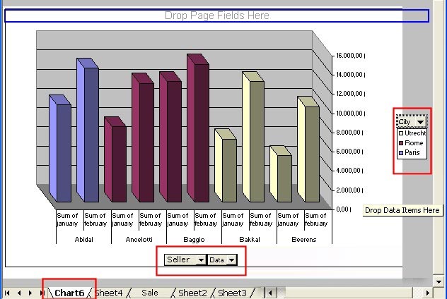
Filter objects in the “Pivot table”, will also be applied in the “Pivot Chart” and vice versa.
In the “PivotChart”, the column data from the “PivotTable” is shown as legend, and the row data as categories.
We can always change layout of our “Chart” by selecting and right clicking on our “Chart” and choosing “Format Chart Area” or “Chart Type” .
“PivotTable” options
If you want to view or change the options for the”Pivot table”, click the “Pivot table” button ,
and select “Table Options …” from the dropdown menu.
This opens the dialog box:
At the top of the “Name:” text box, we can enter a name for our “PivotTable”.
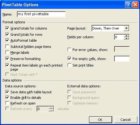
In the “Format Options” section, we can choose several options that reflect on our data in our “PivotTable”
In the “Data Options” section, we determine how the data will be treated further.
When the options are all set, we click on OK.
Page view options
When we add “PivotTable field” in the “Add Page” section (that is upper part) of the “PivotTable”, we can filter the data that we wish to view in that “Field”.
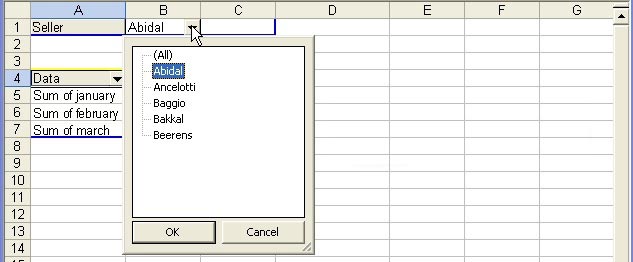
We can even create a separate worksheet for each unique entry from that “Field”, if you would like.
If you want to do this, first select the “Field” in the “Page” section of your “PivotTable”.
And you click on the “Pivot Table”, in the “PivotTable toolbar”.
Select “Show Pages …” from the dropdown menu.
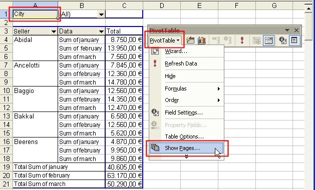
In the “Show pages” dialog we choose the name of the “Field” for which we want separate pages.
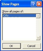
And click OK
Excel will create a new page for each unique value.
Note that when you work with “Fields” in the “Page” section of the “PivotTable”, you can select only one value or all values from the dropdown menu.
You can select any combination of two, three, four … values.
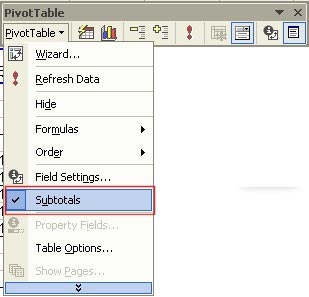
Using “Sub-totals” in “PivotTables”
We can add “subtotals” to the “PivotTable” column when we have different “Fields” in this column.
To do this we click somewhere in the “PivotTable”, and click on the “PivotTable toolbar”.
In the dropdown menu we select “Subtotals”.
To remove “subtotals” from our “PivotTable”, we repeat these same steps.
“Sort” and filter “Fields”
To “Sort” data and filter data in our “PivotTable”, we first select the “Field” on which we want to “Sort” or filter.
Then we click on the “Pivot Table” in the “PivotTable toolbar”.
In the dropdown menu we choose “Sort and Top 10 …”.
In the dialog that appears, we have several options.
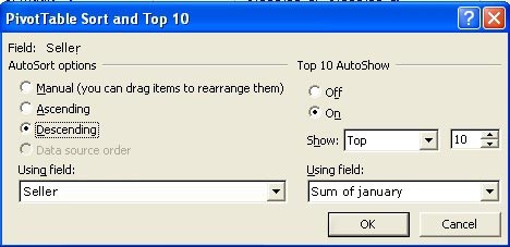
We choose “Ascending” or “Descending” order for “Sort”, choose a “Field” which we want to “Sort” and in the “Using field” box.
We choose “Top 10 AutShow”, then the highest or lowest values of that “Field” are shown.
In that section 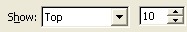 we give the highest and lowest number.
Use the “Using field:” to determine on which “Field” you want to apply these settings.
When you’re done, click OK.
Note that the title of the “Field” on which we have applied our filter, is now in blue.
This is easy for us to distinguish the filtered and unfiltered “Fields” from each other.
If you want to remove the filter, repeat all the steps but select “Off” in the “PivotTable Sort and Top 10” dialog box.


